

the rulebook
needed a redesign.*
*so i redesigned the rulebook.
there was a lot of good information. finding it was another story.
Our content guidance had grown alongside the team. The information was useful, but the experience of actually using it had become dense, text-heavy and difficult to scan.
I led a visual redesign focused on making the playbook easier to navigate, easier to understand and much easier to return to when someone needed an answer quickly.
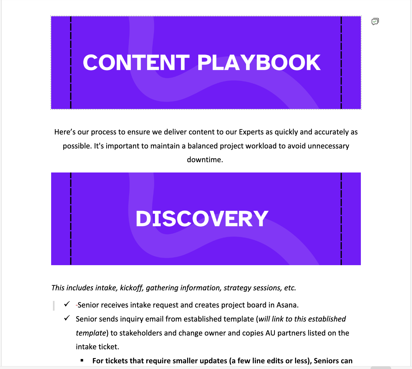
01 / BEFORE
the working document
(click for more)

02 / AFTER
the redesigned playbook
(click for more)
hierarchy
I created clearer visual levels so readers could understand where they were before they started reading every word.
navigation
Long stretches of information became distinct stages and sections, making the playbook easier to scan and revisit.
visual patterns
Repeated information got repeated treatments: flows, cards, callouts and visual cues that taught readers how to use the resource.
personality
The playbook became visually memorable without losing the structure and clarity an operational resource needs.
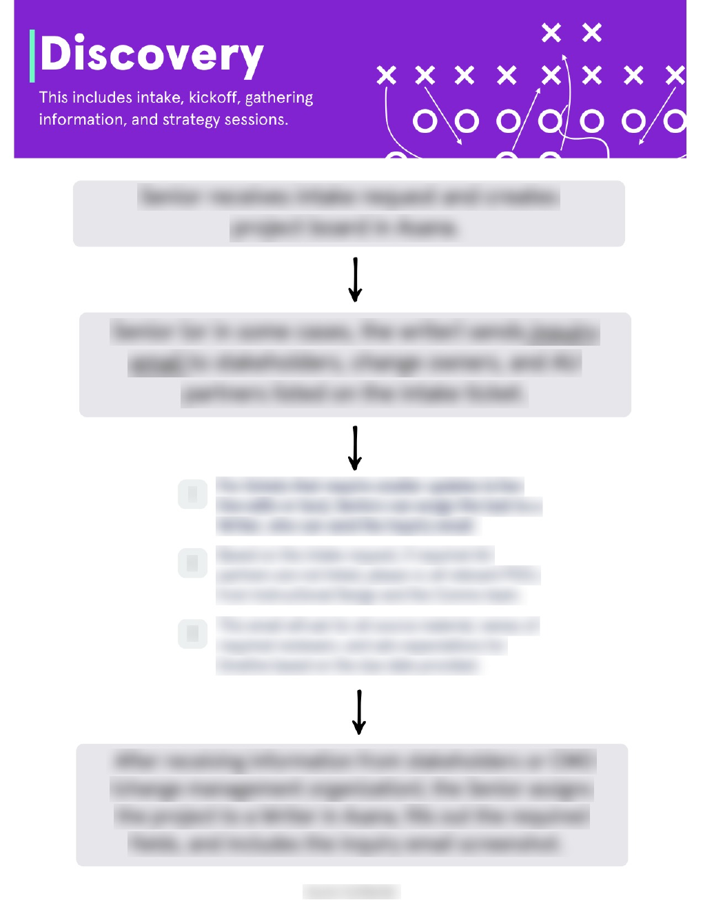
design note / 01
one long process became something you could actually follow.
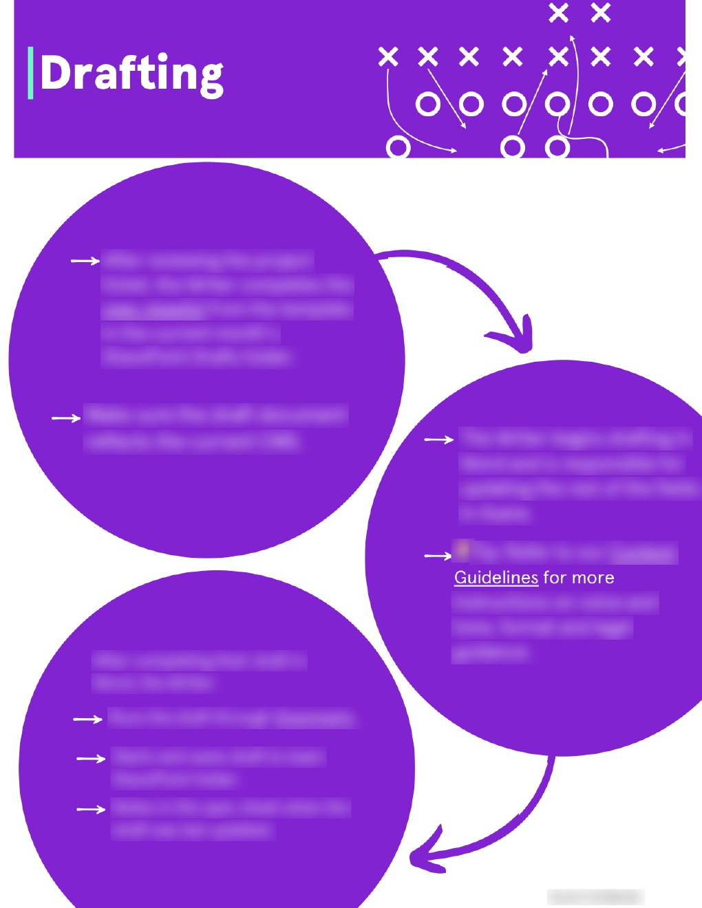
design note / 02
different information deserved different ways of showing up.
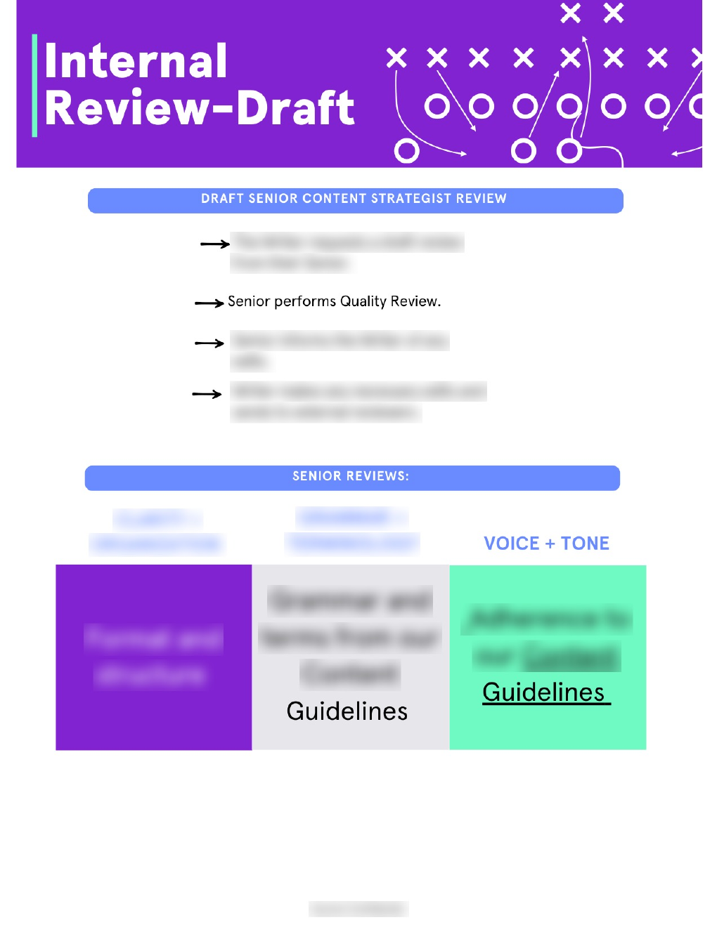
design note / 03
yes, i have opinions about information hierarchy.
good content isn't just about what you say. sometimes it's about making the answer easier to find in the first place.